Before I dive into today’s topic, let’s chat about our current situation.
It has now come to everyone’s attention that we’ll be spending more time than ever at home with our families and quarantine friends especially with fall and winter coming.
During COVID I’m finding that more of us are looking around at our homes and realizing how important it is to create a living environment that we love and functions well for our families. One surefire way to improve the look, feel and function of your home is to uplevel your lighting.
That’s why this is the perfect time to “shed some light” (sorry, couldn’t resist) on how to select the perfect lighting for your space. Lighting is critical to any design plan and it’s especially important for enjoying those upcoming dark, chilly nights at home!
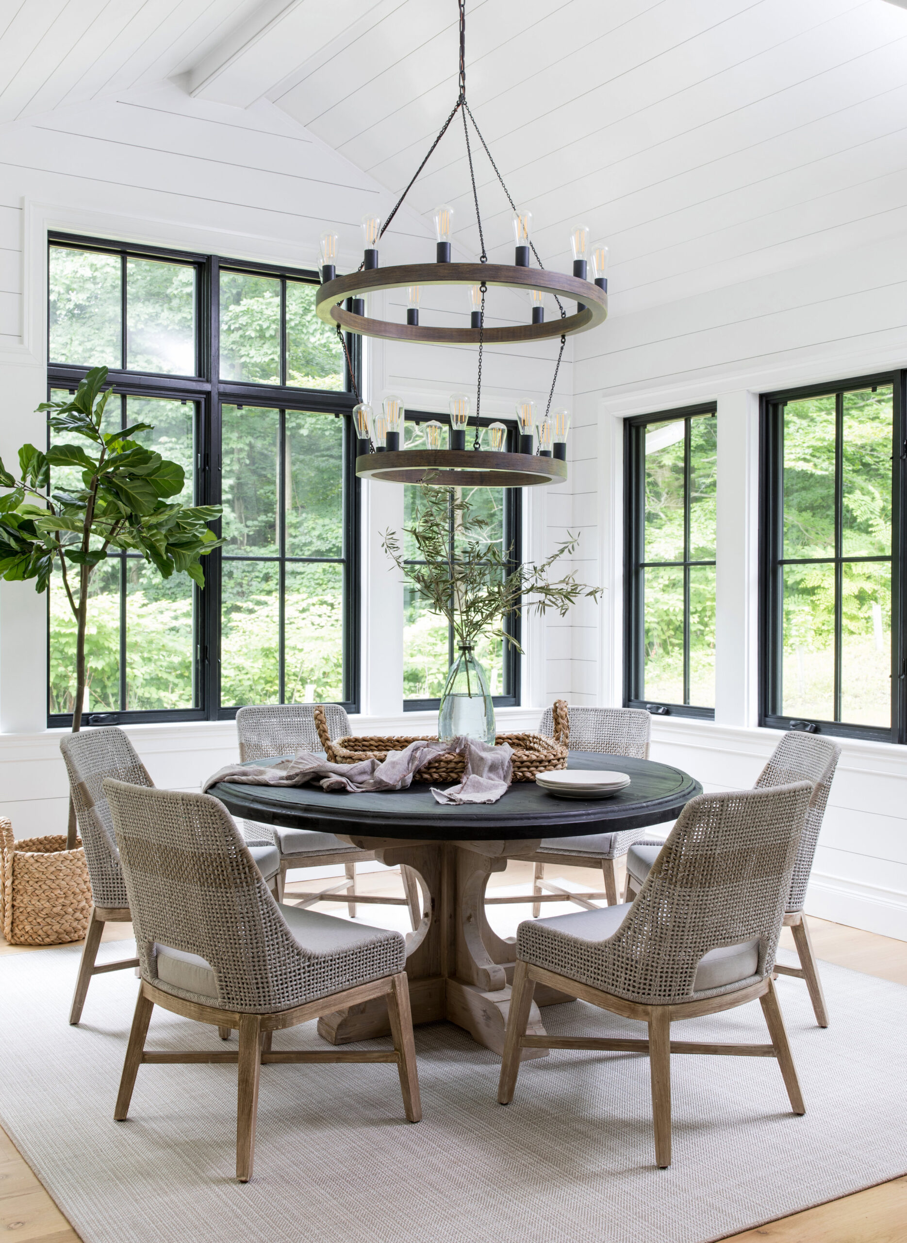
How Decorative Lighting Can Work in Your Space
-
Lighting can be used to define a “room” in your home (especially if you have an open floor plan)
-
Scale matters… more on that later
-
Lighting should work with your design, not as an afterthought
-
Lighting should enhance the view, not obstruct or compete with it
Now, let’s see this put into practice! By the way these are not “rules,” just some guidelines we use when selecting decorative lighting!
Minimalist Lighting
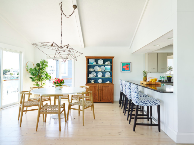
Lighting Style: “Cool” factor, light, airy, free-form
Our clients wanted this space to feel minimal and open but without some of the restrictions of minimalist design. A heavy chandelier wasn’t going to work here. We chose this lighter-framed option that subtly mimics the pattern on the chairs.
The thinness of the fixture doesn’t block the view and its airy, sculptural form keeps it from feeling visually heavy. It’s got the cool, unique factor we were looking for in this space.
Lighting that Creates Contrast in Your Design
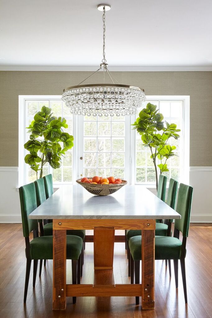
Lighting Style: Elegant, classic, oversized
Because we opted for these gorgeous green velvet chairs first, we knew we wanted them to be the star of the show. Choosing a dark and dramatic chandelier would have cramped our chairs’ style.
We chose this crystal, polished nickel chandelier. It’s classic, beautiful, and adds an air of luxury to the whole space.
Instead of competing, it enhances the richness of the deep green velvet and elevates the industrial look of the wood and marble top dining table.
Statement Lighting that Mimics Other Design Elements
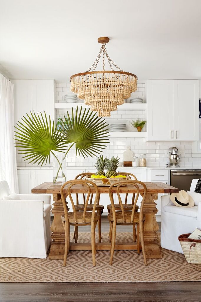
Lighting Style: Statement eye candy, wood-beaded chandelier, oversized
This two-toned kitchen needed some more wood tones to balance out the large wooden table.
In this case, the wood-beaded chandelier is perfect. It feels beachy, it’s weighty enough to not be overwhelmed by the table, and it evokes just a touch of paradise in this space.
PRO TIP: This situation brings up the question of when to subtly mimic your design (as done here) and when to go in another direction (like in the “contrast lighting” example above).
Here’s the answer. Ask yourself… without the lighting, is my scene in harmony? In the previous dining room, yes — without the chandelier, the room feels like it’s missing something, but the design still works.
In this space, without the wooden chandelier, the table and the kitchen cabinets look like they could belong to two entirely different spaces. This is when you need another element to bring the two together!
Mimicry is your answer.
Lighting to Create a “Room”
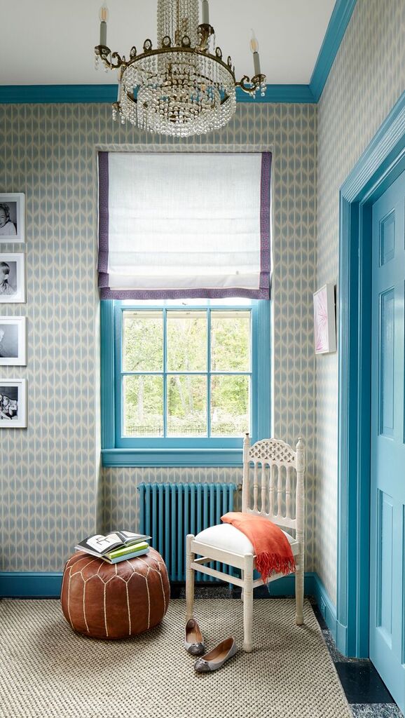
Lighting Style: Traditional, elegant, chandelier
This is the perfect example of lighting being used to create a “room” within a space. Here, this once-casual corner becomes a fancy vestibule!
You can also see how the elegance of this chandelier creates an entirely different feel than the space has without it — now it feels sophisticated!
Lighting that Hugs the Room’s Perimeter
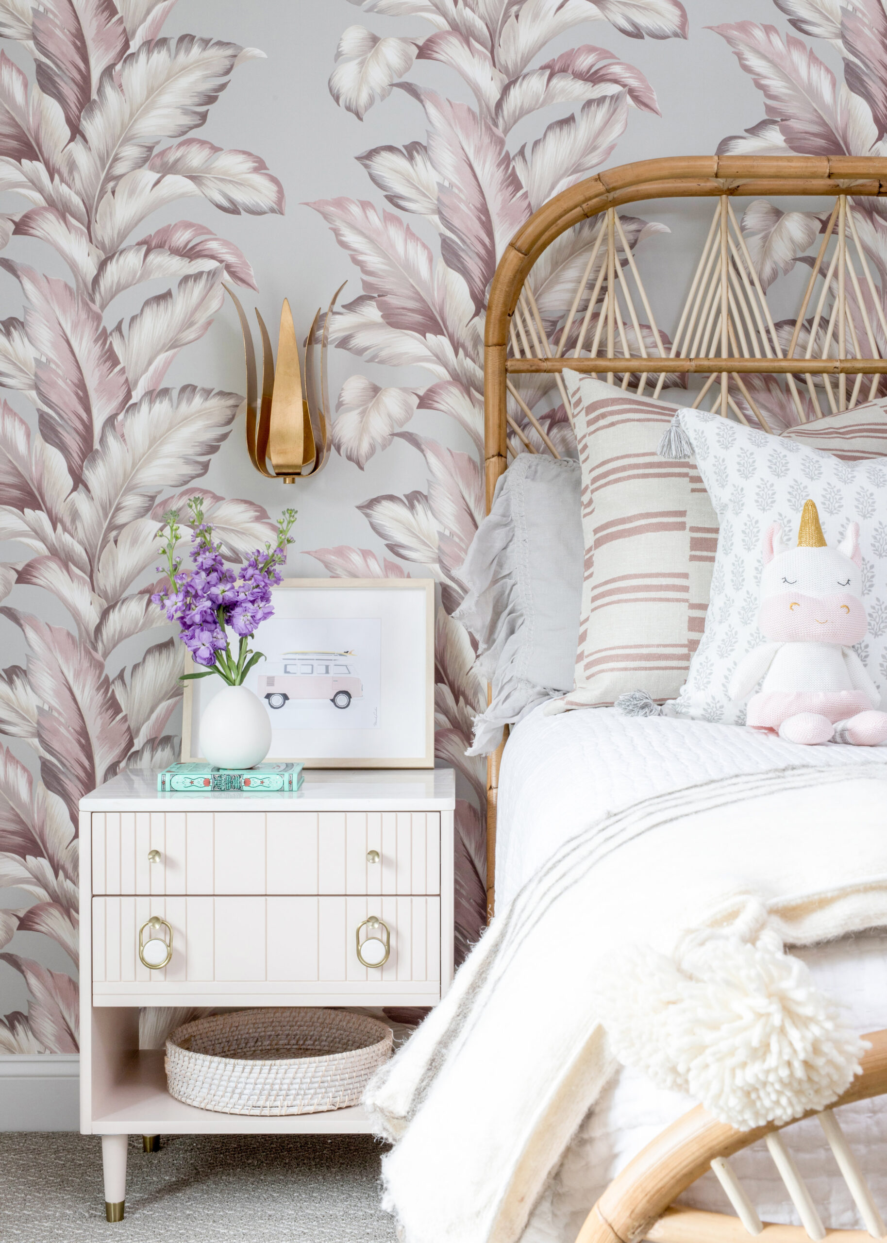
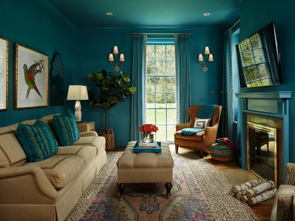
Lighting Style: Symmetrically-mounted statement sconces
Colored walls can make a space feel smaller if you’re not careful. Here, a chandelier would have intruded upon the height and openness of this space. Instead, we went for recessed lighting and these statement sconces.
The sconces don’t block the view and add just the right amount of elegance and personality. Love these!
Bold Statement Lamp
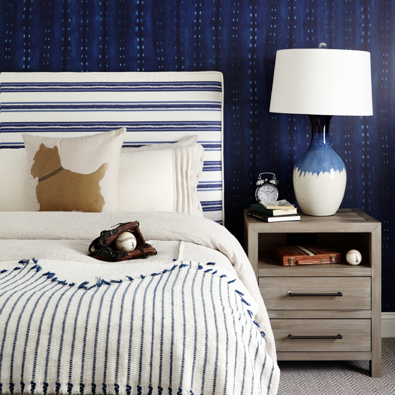
One Room Challenge Project
Lighting Style: Lamp, casual, oversized
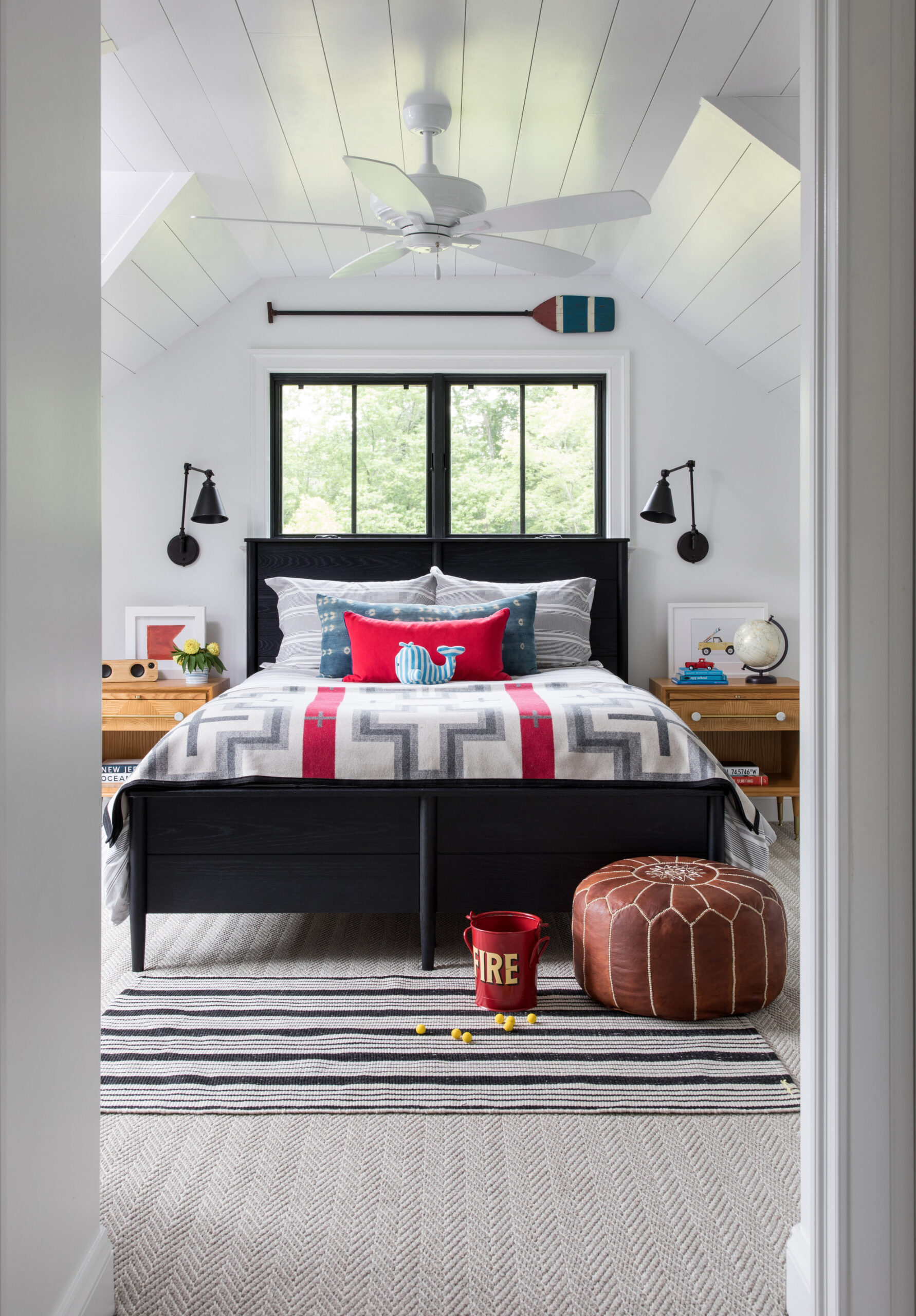
Especially if you have a fan on the ceiling, sometimes a bold table lamp in the right SCALE is just enough.
If there is one pet peeve I have, it’s dinky lamps. Just don’t. Here, I picked an oversized lamp that sits just a bit higher than the headboard. The scale keeps the lamp from being overshadowed by the headboard. Now, it has visual presence that adds to the design.
One Last Note About Lighting…
I mentioned that scale matters, and you should have been able to see that throughout. There’s just one more scale note I want to point out.
It might be difficult to see from the angles, but is there anything you notice that the scale of the chandeliers have in common?
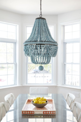
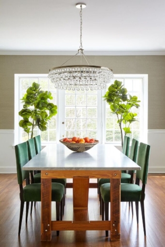
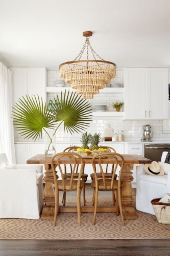
The widths of the chandeliers are almost the same widths as each table!
When you’re picking a chandelier to go over a dining table, scale matters. If you want it to make a statement and be part of the room, the width-to-width rule is a nice guideline to get you started.
Okay, that’s it for now. I hope this lighting lowdown was insightful, helpful, and inspiring. If you’re considering your home’s lighting this season and get a little stuck, feel free to ask questions in the comments below!
Before I go, I also want to take a moment to share my gratitude with you. Even during this crazy year, the moments we share with each other — at home, with our families can be made more beautiful so let’s look around and see how we can improve our environments!
In the meantime, don’t forget to sign up for the SKD newsletter in the sidebar. We’d love to share more advice and inspiration with you!
Thank you for educating us, I’ve learned so much from you! I would love advice on picking an overhead light for a bedroom! I have the Doorman Designs Josephine canopy bed on order and want a beautiful lighting fixture that won’t compete with the bed. (To add to the tangle I have a planked ceiling.) I’ve been scrolling through your work and seldom see a ceiling light featured in an adult bedroom—do you recommend picking something simple for overhead and playing up the bedside lighting? I’m drawn to fixtures like Thomas O’Brien’s Osiris reflector, Visual Comfort Hampton, or PBTeen’s Large Capize Chandelier, but don’t want to have too many stars like you say. (My home is a 1920’s cottage with most of the original charm in tact but sometime in the past 10 years someone replaced the original fixtures with boob lights and cheap big box ceiling fans #cringe)
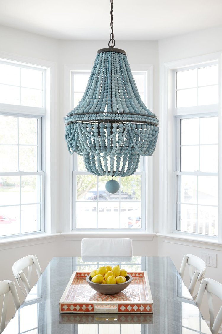
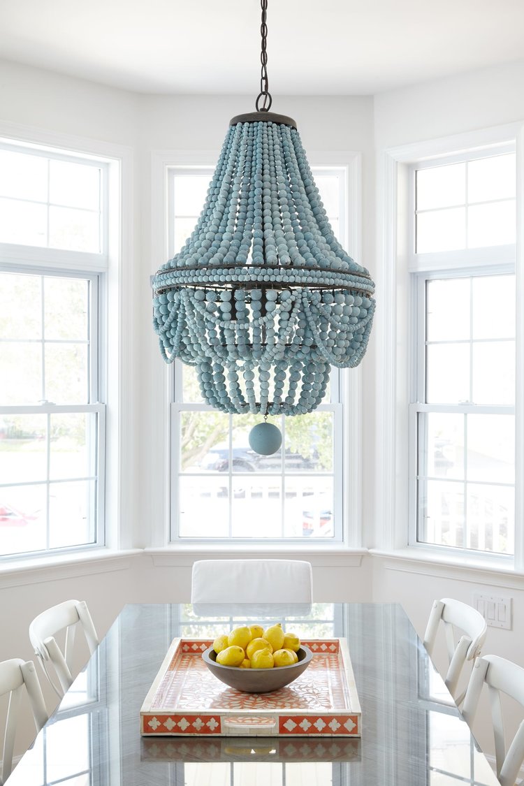
Hi can you tell me where the blue chandelier if from please?