My team and I are dashing off to High Point this week, but before we head there I wanted to share a dining room and butler’s pantry Before and After.
We’ve been working on this large Main Line home for a few years now, designing it room by room! You can read more about the bold library we designed in this blog post here: Before and After – Teal Blue Library.
For the second phase of this project, we redesigned the dining room and a dual-function butler’s pantry/office. I can’t wait to show you inside…
Dining Room
BEFORE
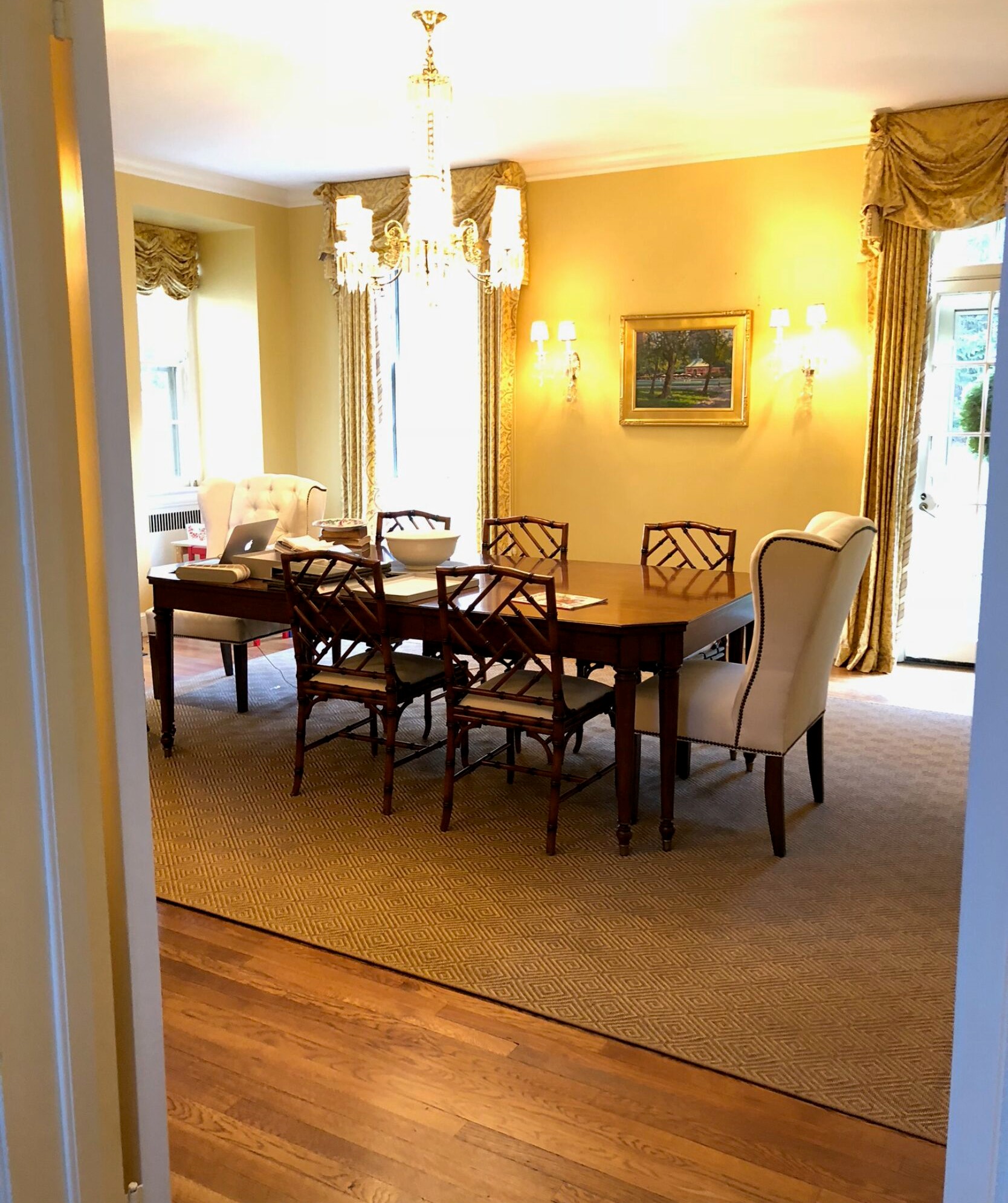
A little yellow, a little lackluster, but the room has great bones. Look at the original chandelier and the height of the ceilings and windows! And of course, we’ll be zhushing up those classic chippendale chairs.
AFTER
From sunshine yellow to…
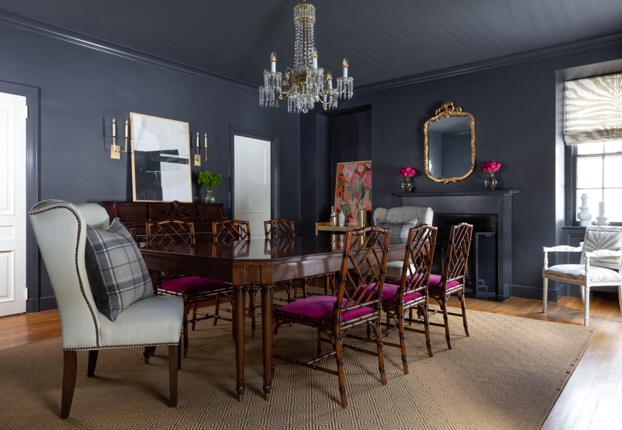
…dark grey drama!
Bright fuschia accents are stunning against a backdrop of dramatically dark walls, trim, and mantle. The Scalamandre roman shades and brass bar cart (far corner) complement the traditional chandelier, wingback chairs, and this elegant gilded mirror.
Professional tip: The most economical way to refresh a space is by adding a dramatic paint color.
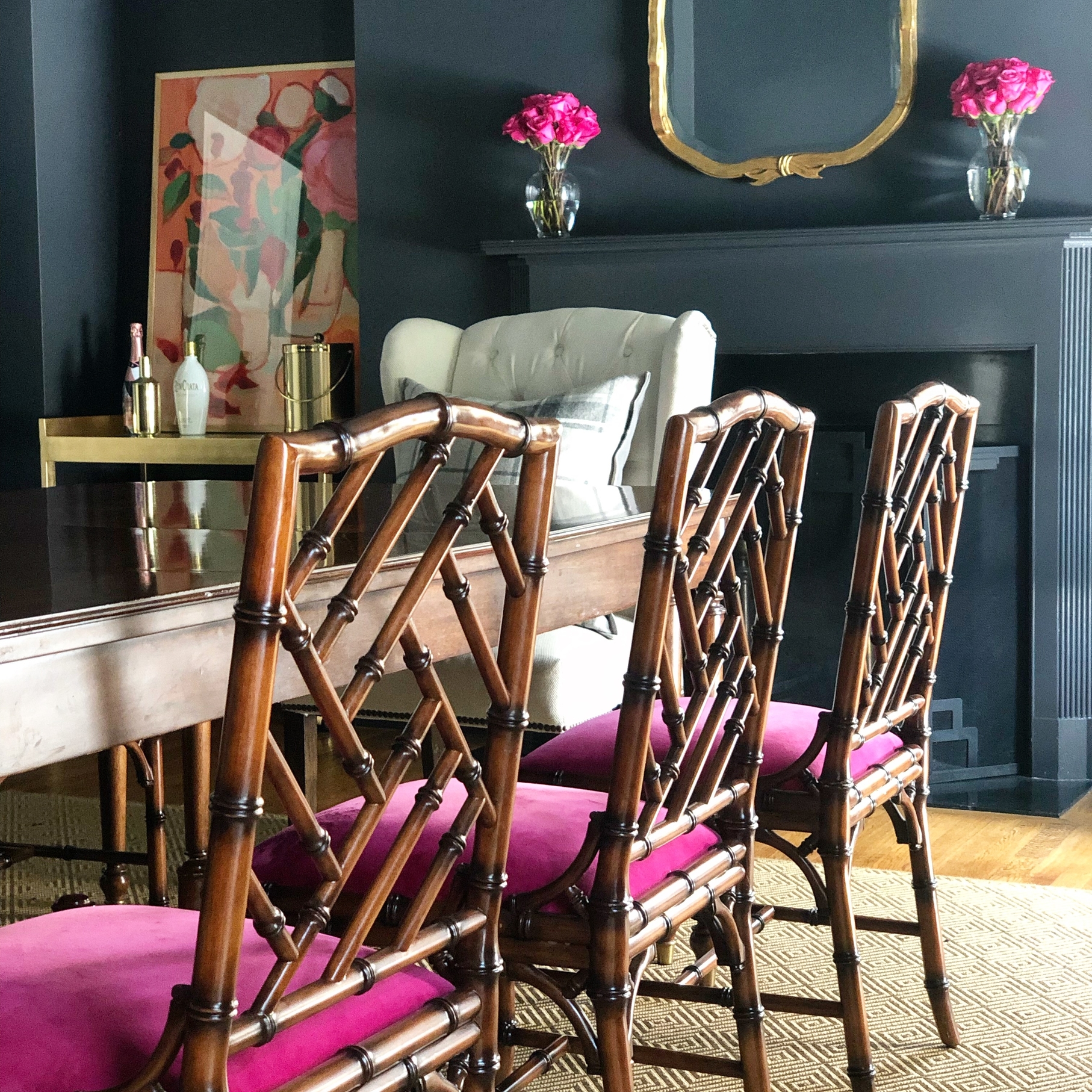
We gave these chairs a lot of love by reupholstering the seats in a rich fuschia velvet.
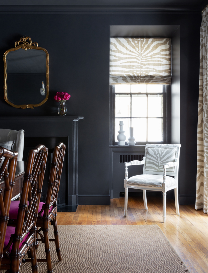
The sophisticated Scalamandre shades, drapery, and chair introduce a touch of modern-day chic that still speaks to the traditional architecture of the house.
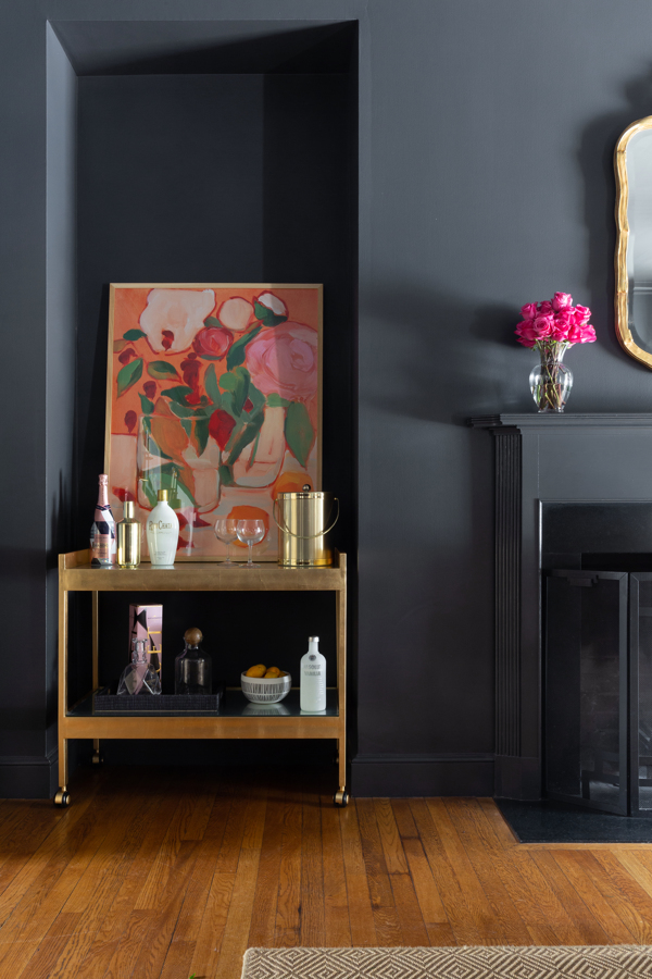
Every dining room needs a bar cart! We chose this simple cart in brushed brass to complement the gilded mirror and other touches of brass throughout the space. It was the perfect setup to place in this little nook.
Meanwhile, the abstract floral painting brings the whole design together with bold color and a modern feel. Pour us a drink, and we’ll stay here forever! Just kidding, AW!
Butler’s Pantry / Office
We redesigned this dual-function butler’s pantry and office next. The dimensions of this space posed the greatest challenge. Narrow spaces can end up looking dark and dreary if you’re not careful.
You’ll see what I mean in the Before photo…
BEFORE
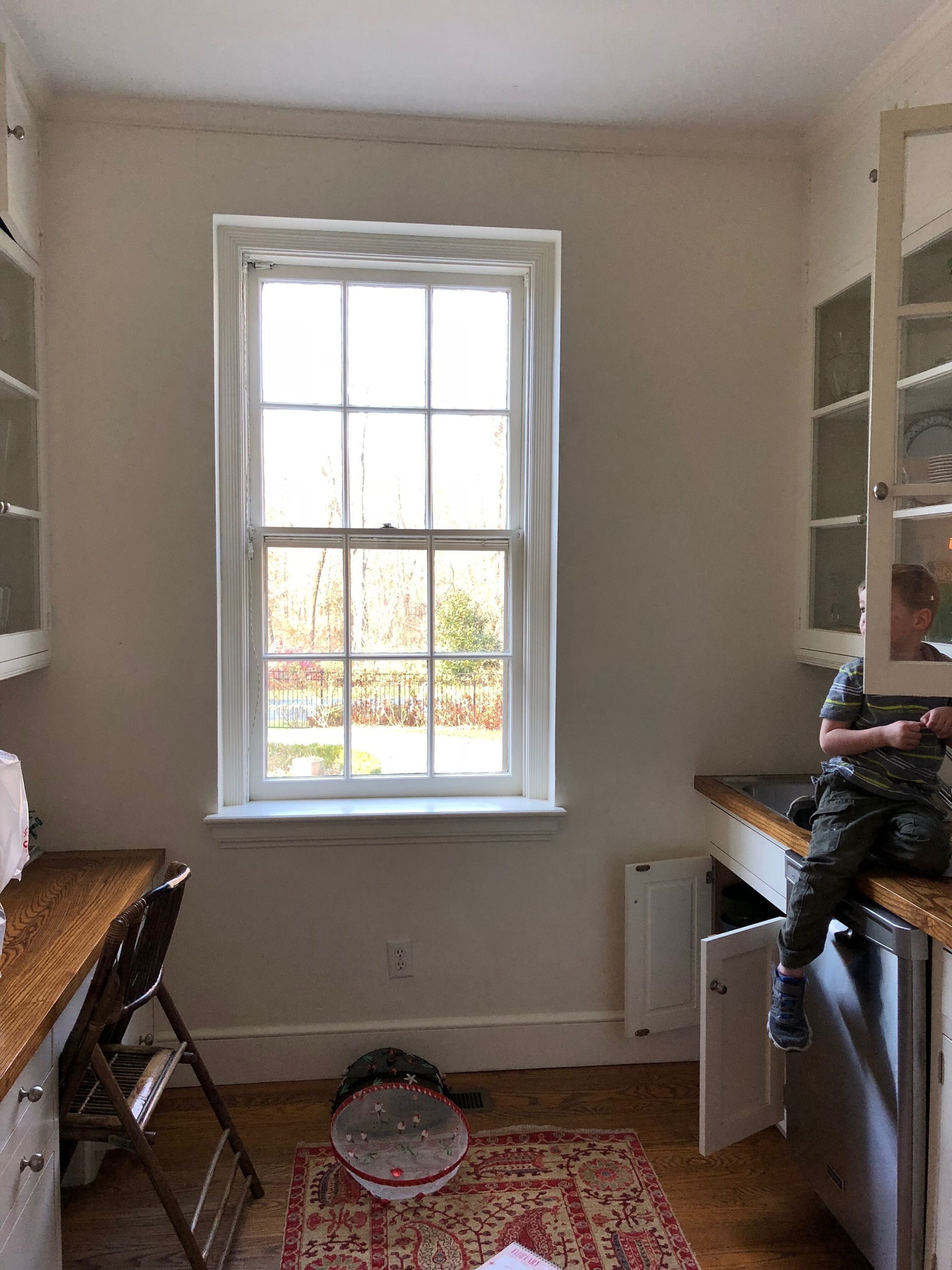
A great space, beautiful original cabinets, but in need of a serious refresh. We also wanted a stylish new space for this adorable cutie to stash his candy!
AFTER
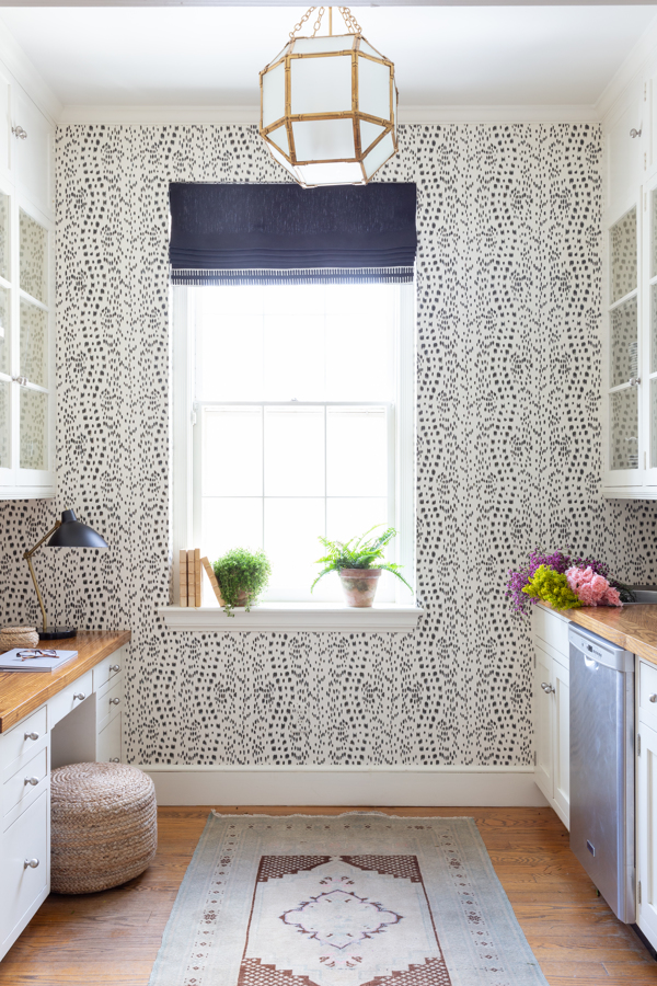
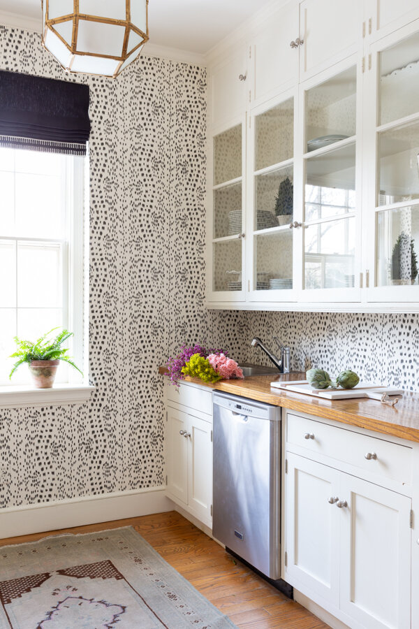
The traditional Le Touches wallpaper creates movement in the space without feeling too busy, and the ebony roman shade makes the white of the wallcovering pop even more. Fresh, bright and fun — mission accomplished.
That pendant is one of our favorites, too. Selecting frosted glass hides dirt… which is important when you have 9½ foot ceilings!
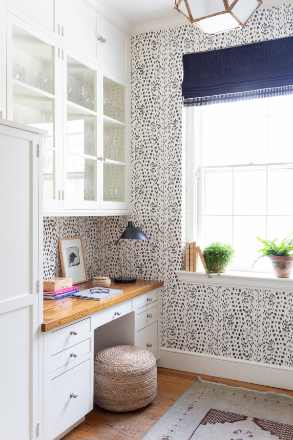
These cabinets are original to the house, and options for desk chairs that would fit were abysmal. So we chose a structured jute pouf. It doesn’t take up much space and can easily be stored underneath when our client isn’t working. Plus, it ties in the freshly oiled butcher block countertops and adds much needed texture to the room.

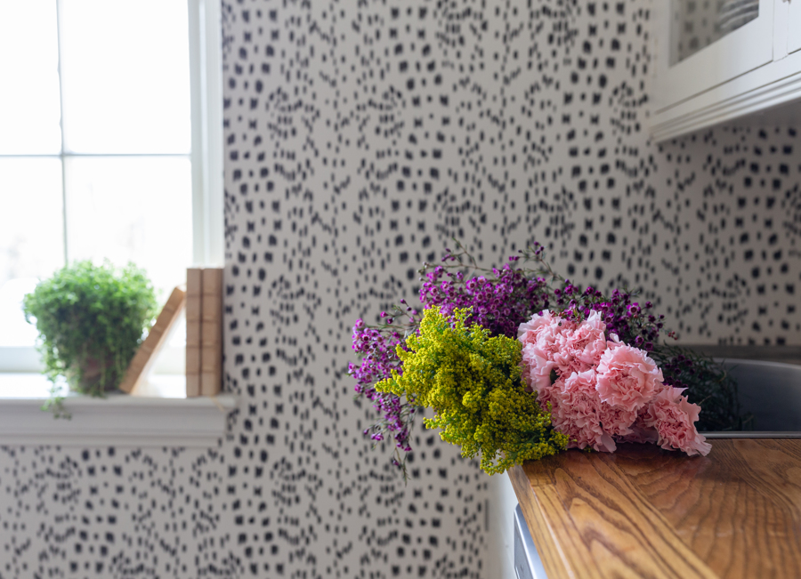
Greenery, greenery, greenery. It’s so important when styling your space. This is the perfect spot for my client to create flower arrangements prior to dinner parties and holiday entertaining.
That’s it for now, but make sure to follow along with our Instagram stories over the next week — I’ll be posting all my fabulous finds from High Point there.
And don’t forget to subscribe to our blog/newsletter, or you’ll miss our High Point Trend Report coming later this month!
In the meantime, thank you so much for being a part of our design journey. We love having you in our tribe — it means the world to us!
See you soon,
Stephanie
All photography by Raquel Langworthy Photography
