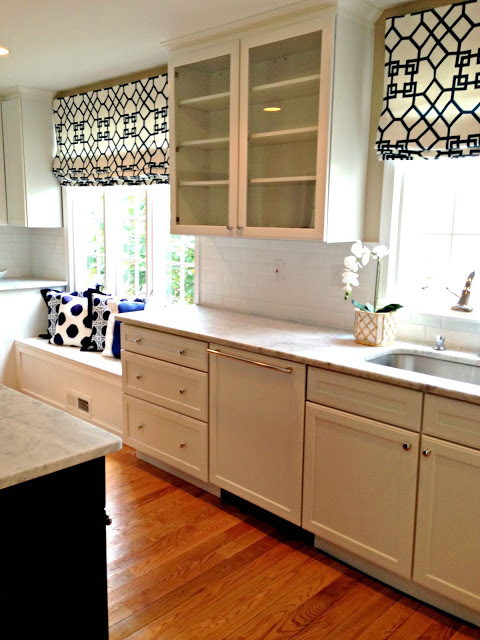
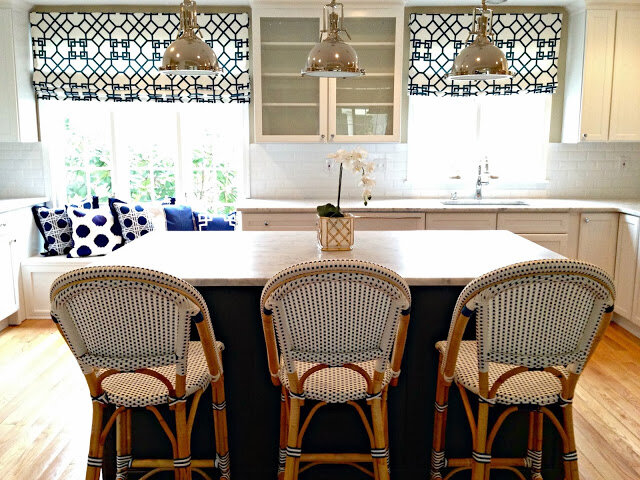
So we have blue and white client kitchen progress…woot woot!!
This kitchen is the second phase of a dining room makeover which I revealed in Calling it Home’s
…. you can see that before and after
.
Still needs the window seat cushion, accessories, rugs and the range hood but we’ve come along way baby!


Cache pot from Domocile, Wayne PA

Let’s recall the before, shall we?


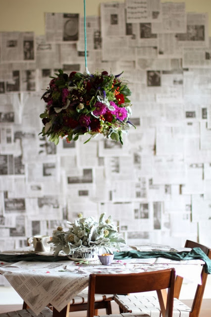
Cool huh? Especially if you will be hosting Thanksgiving.
Breathtaking if hanging over your table:)

Wanna impress the fam? Here’s how to make it
And you don’t have to use brown and orange Thanksgiving colors — use fun fresh fab colors and shake it up!!
Like what you see? Hover over the image and pin it
and don’t forget to like me on facebook!
Thanks for reading!! xoxo

Wow – looks great! For a second I thought this was YOUR kitchen (the island/sink area kind of looks the same 😉 )
Beautiful job on the kitchen!! Have to pin it!
Beautiful!!! Destined to be a classic, but forever fresh! I especially love the Roman shades, Stephanie. xLoi
I'm loving that kitchen – so ingenious to chop off the peninsula and add that awesome island!!
Stephanie, I love how this kitchen came out and am so encouraged, given that my kitchen is similar in layout to the "before" and all I do is daydream about renovating it. I love the island, amazing countertops, glass cabinet doors, window treatments, built in bench…counter stools…..all of it!! Fabulous job!!!!!!
this is so pretty! Love the kitchen, what type of counter tops are they?
Nice job on the kitchen renovation! I'm pretty sure your client will love your creation. Allow me to bookmark these photos for my new house renovation. Hehe! Anyway, thanks for linking the tutorial for that fabulous chandelier. I'll do this for the coming Christmas. 🙂
Scott @ ScottSauer.ca
Wow you did a spectacular job!! It is sooo very pretty..enjoy!
Stephanie, I missed this and it is fantastic!! I am dying over the window seat area with the custom shade. I want a new kitchen.
Wow! The kitchen looks amazing and I'm sure your clients are thrilled with how it turned out. What a transformation.
Stephanie your new kitchen is wonderful!I love anything from Serena & Lily; the stools and pillows are perfect!
xoxo
Karena
The Arts by Karena
You nailed my ideal kitchen. I have one much like the before but I am dying to know what you did with the door to outside. Its my biggest obstacle in a redesign.
Soooo beautiful, Stephanie!! I absolutely LOVE the fabric you selected for the windows… You have done such an AMAZING job!!!
XOXO,
The Glam Pad
Gorgeous. The romans are killer…and I was just looking at those bar stools last night!
Great choice!!!!
Amazing. Seriously perfection. I am obsessed with the Serena and Lilly bistro chairs (I actually almost posted about them for the party today)! And the shades and the caning print on those pillows and those pendant lights!!! Just to die for! Sooo can you do my kitchen next?!
I'm crazy over these shades! And the pillows! Thank you so much for linking up today, Stephanie!
Loving the textiles, beautiful mixture of patterns. The kitchen is looking stunning.
Stunning kitchen!
There is something about Blue and White in the kitchen. Beautiful. I really enjoyed this inspirational post. I would love it if you would share this post at our WIW linky party? Hope to see you there!
Paula
ivyandelephants.blogspot.com