Hello again, design lovers! First, if you’re reading this, THANK YOU for enduring my long absence here on the SKD blog.
In case you’re wondering where in the world I’ve been, after our spring features in HGTV Magazine and Clientele Luxury Magazine — surprise, surprise — our schedule kicked into high gear! It has been a true rollercoaster ride (the good kind), and we couldn’t be more humbled and grateful for every moment, opportunity, and delightful client that has come our way.
Now, let’s get down to business!
This month, I want to share a design topic I’m pretty passionate about and love incorporating into our clients’ projects. It’s not a new style, but it has such a powerful visual impact that it’s absolutely worth discussing with you…
Two-toned kitchens.

Are you drawn to two-toned kitchens? If you are, you might have noticed many beautiful photos but very little insight into how the two-toned look affects your space. And it definitely does!
I’m going to show you 3 kitchens where the two tones impact the spaces differently. These should give you a good launch point for deciding which look might be best for your own home. So let’s dissect this together, shall we?
How to Use Two Tones to Create Visual Height in the Kitchen
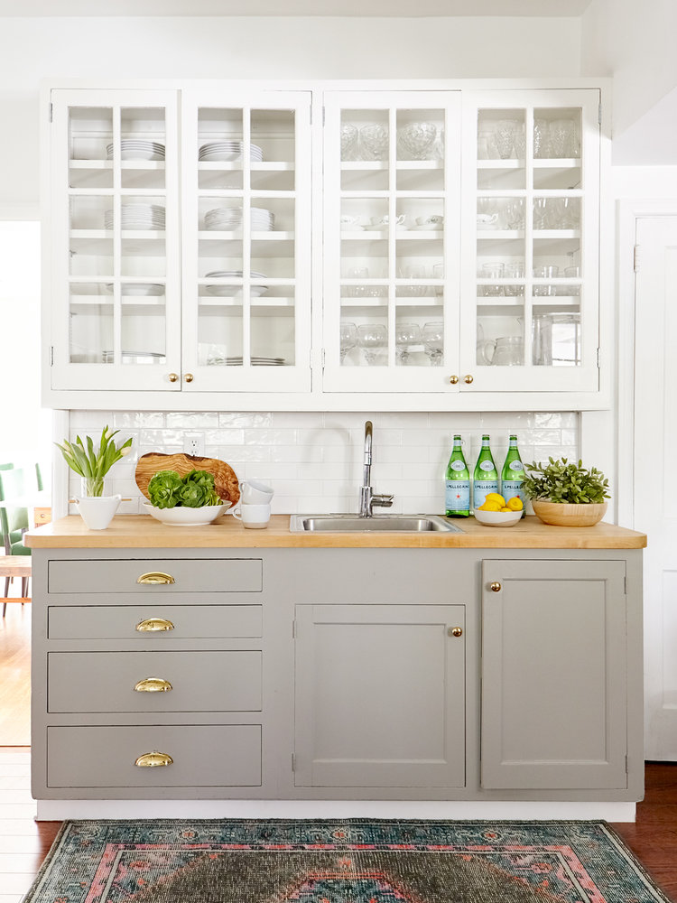
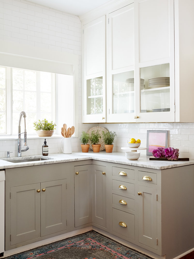
In this kitchen, we painted the lower cabinetry a warm taupey-gray, while the upper cabinets boast a clean, eggshell white. We used the subtle tone difference to create a pleasing visual separation, but here’s the trick…
The gray grounds the design and the lighter white blends into the ceiling space. This placement visually raises the height of the room, making it feel more spacious! And who doesn’t want more space? Even if it’s in our minds. 😉
Also, I just LOVE how the brass hardware plays up the warm undertone of the gray. It feels fresh, organic, and sophisticated all at the same time.
We chose this gorgeous marble countertop to help keep the whole design cohesive. Its warm gray and white veins are the bridge between our two tones, helping them feel unified and pulled together.
How to Use Two Tones to Create Bold & Beautiful Contrast in the Kitchen
The previous kitchen example incorporated a subtle two-tone pairing. This next kitchen gets a little bolder…
Can you guess the two tones? 😉
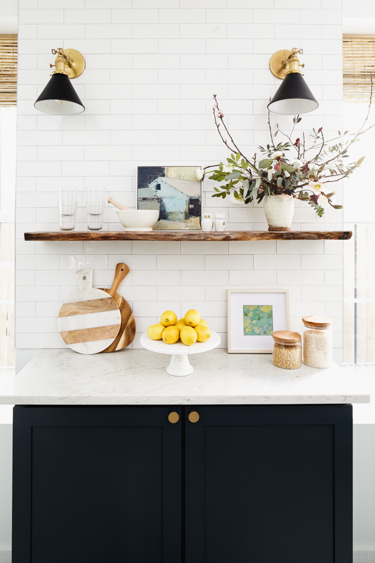
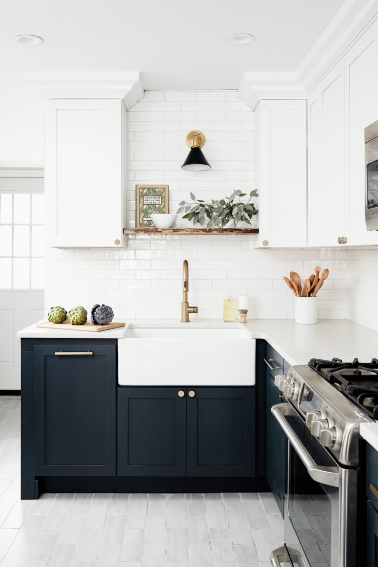
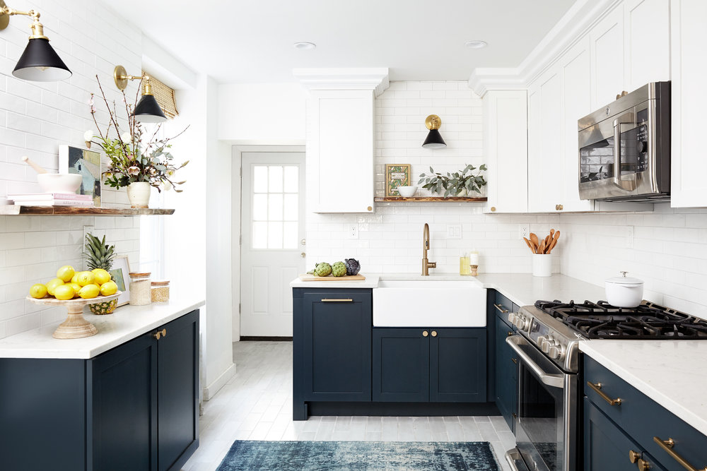
This deep navy (Mt. Etna from Sherwin Williams) and white pairing are a 180º turn from our gray-white combo, but the stark contrast is what makes it so stunning!
You can see that the same ceiling-raising technique is working here. However, because there’s such a drastic contrast between the navy and white, we needed to present some touches of navy higher in our line of sight — otherwise, the kitchen would feel like two halves instead of a whole. (This is a common mistake people make when two-toning their spaces for the first time.)
We opted for these intriguing statement sconces.
Aren’t they fabulous? Not to mention functional with focused downlight. The overdyed blue rug also helps harmonize the navy and white tones. See how it feels very balanced now? A treat for the eyes.
Okay, one more feature I want to point out… like the last kitchen, we opted for touches of warm browns and brushed brass in this space, too. Without them, the cool tones would have been a little overpowering. Now, the golds and woodsy browns add the perfect dose of warmth and life!
How to Use Two Tones to Create More Space in Your Kitchen
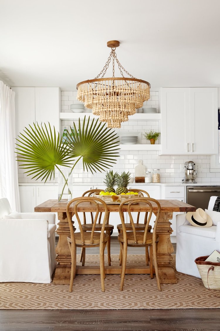
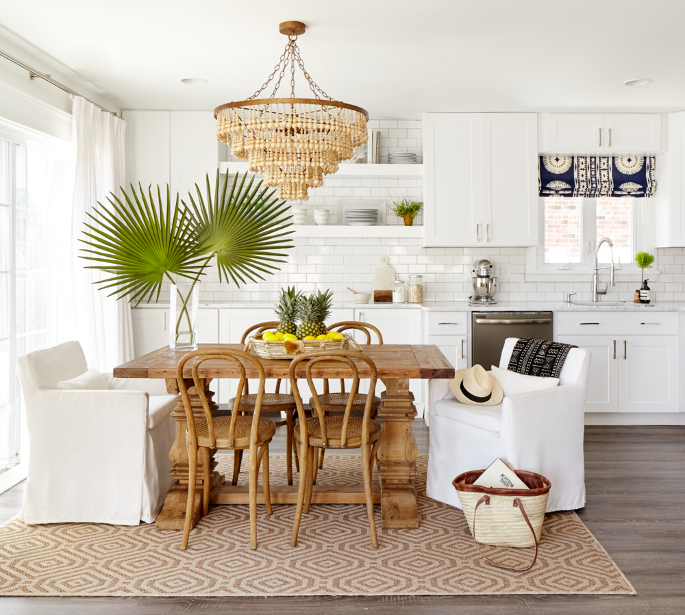
The two-tone kitchen in this 1970s beach bungalow in Avalon has an entirely different vibe going on.
The second tone we chose for this kitchen isn’t a paint color at all… it’s this beautiful, warm wood table that practically steals the show.
When you look at this kitchen, the table immediately grabs your attention. Because it’s the focal point of the room, the area around it visually recedes and the kitchen feels more spacious. (Noticing a trend here?)
To keep the design feeling cohesive, we selected this oversized, wood bead chandelier, a khaki and beige area rug, and dark wood flooring. The collection of wooden spoons on the countertop helps, too.
Just for fun, here are two more two-tone kitchens and islands for you to admire. 🙂
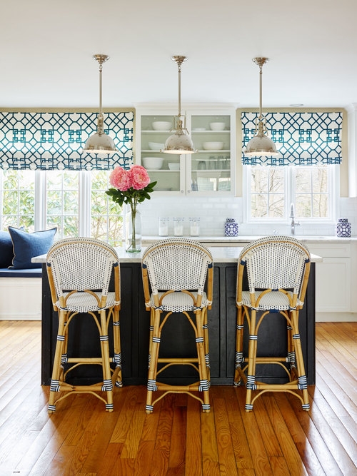
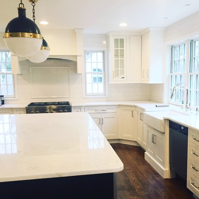
And there you have it! Three entirely different two-tone strategies, three (or five) uniquely beautiful kitchens. I hope you enjoyed seeing the design strategy behind each of these — and feel extra inspired now!
Thanks again for following along with us, and I’ll be back soon with another post. Promise!
All photographs by Kyle Born Photography

I just loved it. I liked these tips to use two tones in a kitchen. these are beautiful pictures. Much appreciated for sharing this post.
Hi can you tell me the paint colors you used in the first kitchen with the eggshell white top cabinets and the taupe bottom cabinets? Beautiful!
I would love to know the taupe color of the bottom cabinets in the Bryn Mawr kitchen – thanks!