And we’re back for week 2! Let’s recap… I’m in the process of designing my son’s bedroom. It is a horrific “before” you can check out the before images here from week one of the ORC.
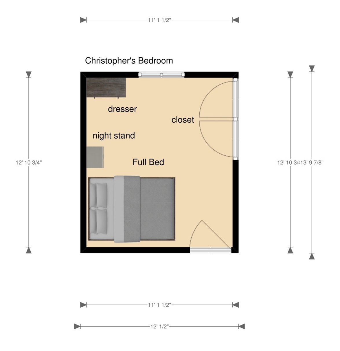
This is Christopher’s new floor plan. It’s a small space and because of the double door closet, entry door and window it’s tough to fit a lot of furniture in here. I decided to put his bed against the wall instead of in the middle of the room to create some open space for him to sit on the floor and spread out his homework, books, etc.(I am very hopeful that is what he will use the space for).

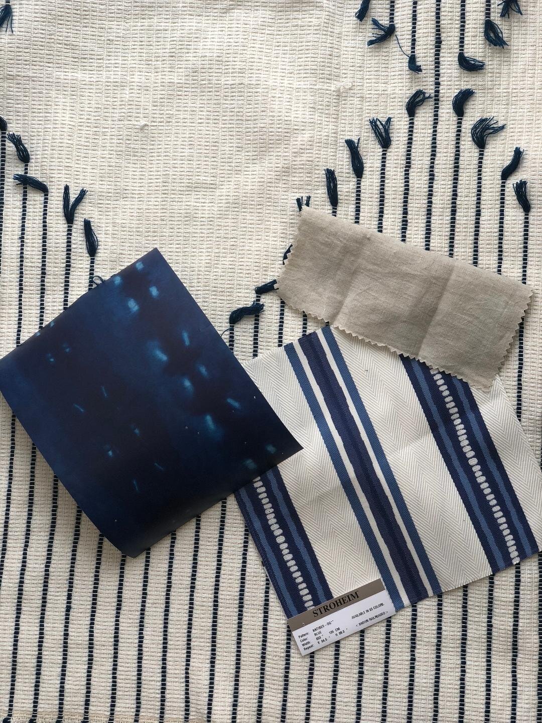
And here is my current fabric/color scheme. Shocker. It’s blue and white… although I promise he did request blue. And nothing else. And I mean nothing else. I asked him if he wanted sporty things, basketball stuff becasue he’s a HUGE fan of Villanova college basketball. All I heard were crickets. Nothing. So I selected what I liked and made sure it was blue. He has plenty of sporty things in our basement anyway:)

So how did I start the process of scheming for this project? Every design I create I start off with a jumping off fabric (most of the time) but in this case it was this wallpaper called City Scape by Milton and King. I LOVE it and it’s perfect for my son’s new space! It’s modern, hip and a beautiful shade of blue.
The next important decision was the fabric for the custom bed which will be the focal point of the whole space. It had to contrast the dark wallpaper and feel fresh but most importantly it had to be durable. This Stroheim fabric is from the Dana Gibson collection and is a crypton fabric called Anitbes-DG. And to confuse my work room we are turning the stripes to read horizontal. Horizontal stripes will make it look crisp, clean and very boyish.
And to neutralize the bold blue I chose this soft linen bedding called Louwie flax linen from Pom-Pom Home. It’s washable, casual and soft. My son will love it.
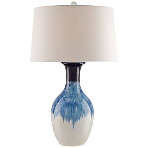
In addition, I had to have this lamp from Lamps Plus. It’s large in scale and simply stunning. One of my pet peeves …dinky lamps. Don’t do it. Always bigger never smaller.

We also need a few staples for the space. A new full-size mattress from Overstock which you can find here and a new VERY cool fan from Haiku. You have to check out their super cool fans here. Two things that are crucial for a good night’s sleep are a comfortable mattress and a great-looking fan to keep the room just the right temperature.
Well, I think that’s all the progress I made this week. And I’m excited and nervous how this is all going to turn out!
Now if you want to see how some extremely talented people are transforming their space please check them out below!
Apartment 34 | Beginning in the Middle | Coco & Jack | The English Room | The Gold Hive
Gray Malin | Jenna Sue Design | Jojotastic | Kelly Rogers Int. | Linda Holt | Marcus Design
Michelle Gage | Natasha Habermann | The Painted House | Rambling Renovators
Sacramento Street | Shannon Claire | Sketch 42 | Stephanie Kraus | Style Me Pretty Living
Media Partner House Beautiful | TM by ORC

absolutely looooooving those shades of blue! can’t wait to see more 🙂
What a cool paper! Also love the Dana Gibson/Stroheim/Crypton Home fabric for the bed!
So your son’s room is going to end up being my dream bedroom, is that what you’re telling me with all this blue and white goodness? Loving what you’ve chosen so far. Enjoy your low maintenance client who lets you do whatever you want!! 🙂
It’s going to be beautiful! Love all the shades of blue.