I’m writing this on a foggy, dreary Sunday morning wondering why my ancestors didn’t settle somewhere sunny, bright and warm all year round. Have you ever wondered that?
I once took a trip to Ellis Island with my son’s school and found the ship’s manifest of my great grandfather (Umberto) who was the FIRST passenger listed on the ships beautifully hand-written manifest (I picture him aggressively elbowing his way to the front of the line:). It said he was 17 years of age and had $11 in his pocket. It also stated he was coming to America to visit his cousins in Philadelphia.
And there he stayed.
So here I am..
I’ve lived in Florida and it was such a great outdoor life (LOVED IT) but friends and family keep us here so we’ll mange through these dreary winter months knowing spring is right around the corner and so is my trip down south next month:))
So back to biz my friends.
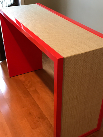
We just received delivery of this gorgeous table which the whole entrance to a beach house will be based on.

It really speaks to the old saying buy what you love and it will always work. This is the perfect example of that. We love selecting pieces like this and then building an entire room around it. It’s our job to select the star of the room and know what to pair it with. That’s where clients get stuck and where we can really help them. We’re always striving for our rooms to feel unique to the family and not feel like the retail chain, big box store or boutique store. We love picking pieces that reflect client’s taste in this case it’s a young vibrant and super fun couple.
Ashley, Taylor (my new team) and I are getting ready to photograph this room.

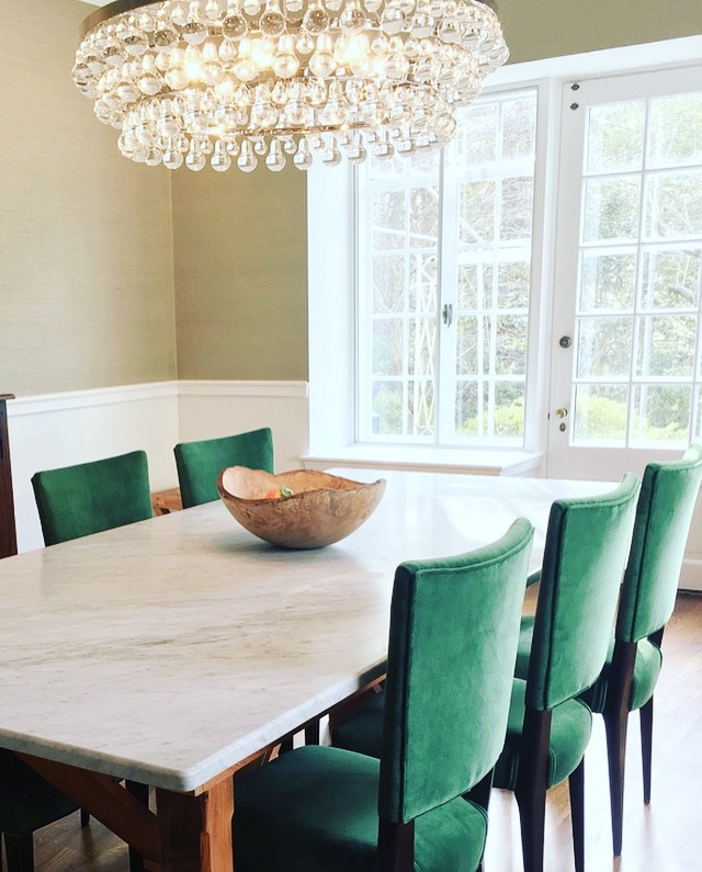
It’s a large dining room with a custom marble table, Robert Abbey bling chandelier, Phillip Jeffries wall covering and upholstered chairs.
Here’s a tip — if you want to make your dining room more functional use upholstered chairs in a contract fabric like we did here. Make sure they’re comfortable and durable if you have kids. I find if your chairs are comfortable to sit in you will use the dining room more for homework, work, paying bills, etc. I like my rooms usable and not museum-like! I hate having rooms no one uses don’t you? Love these chairs by the way they are Italian and they are vintage (Umberto would be proud).
Moving on..
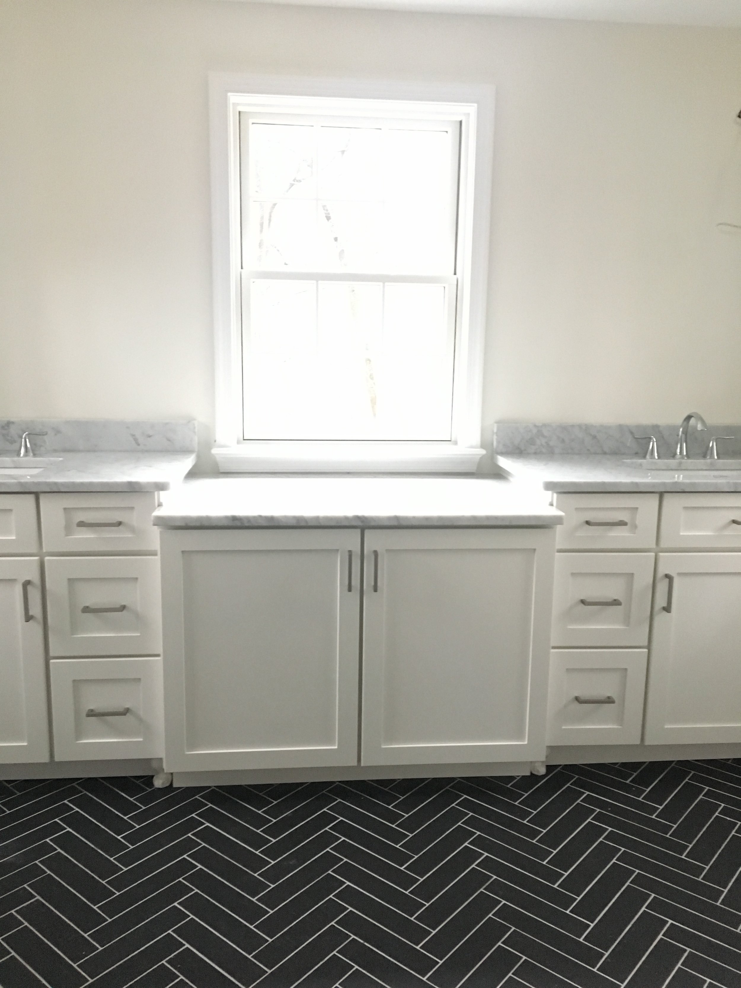
When clients sign on to work with my firm we have them send inspiration pictures and images. In this client’s case, there was one common thread throughout all of their images which was –high contrast elements. Black and white/navy and white, etc. so we incorporated high contrast elements in our design plan. Here’s an example of that … white cabinetry paired with back tile.

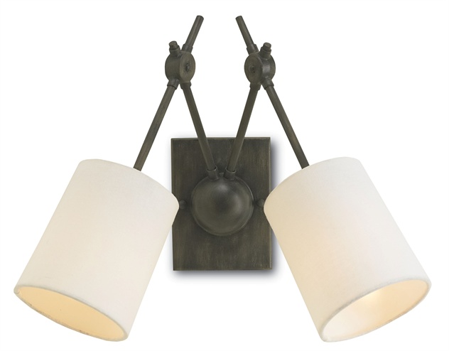
We’re adding custom mirrors in a black frame to tie in the floor. And super cool sconces in aged iron from Currey and Co. We’re debating on shutters vs. woven blinds (my fave- they will add texture and a hint of color) So stay tuned.

A great exercise before beginning any design/decorating plan is to look at items you have pinned or rooms you love and see if there is a common theme… I bet there is:) So when your purchasing items for your space keep those common elements top of mind.
That’s it for now!
Thanks for reading!! xoxox
