It’s been awhile since I’ve written a blog post I know:) We have new several new projects to share with you. COVID has slowed down the blog writing and our photography sessions but not the beautiful new spaces that we have been lucky enough to create for our client’s.
First let’s talk about the kitchen project we wrapped up last October.

It’s a great example of how you can renovate a kitchen without making huge costly layout changes. The original layout of the kitchen worked so we decided to keep it as is. Here is the before real estate photos.
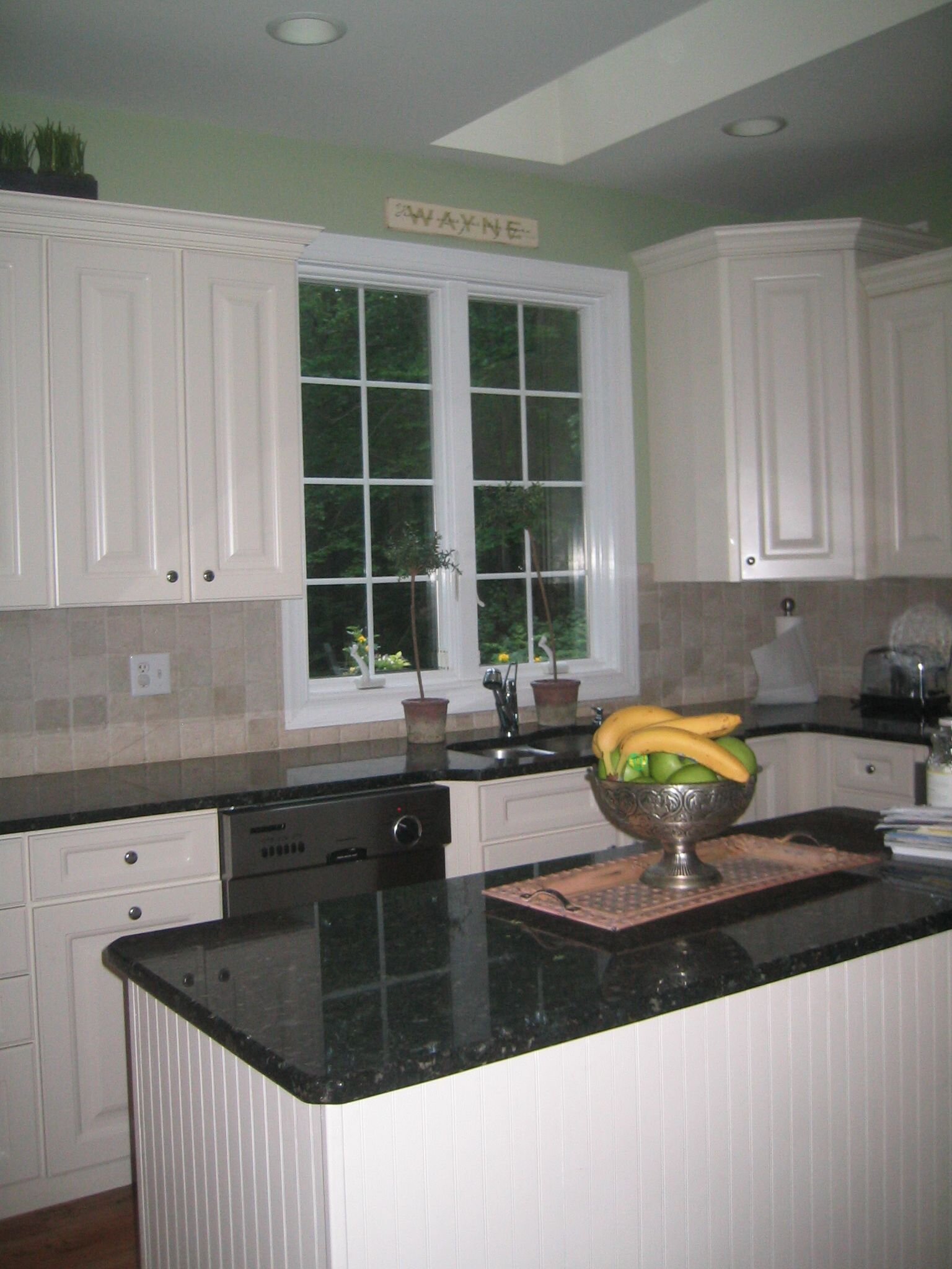
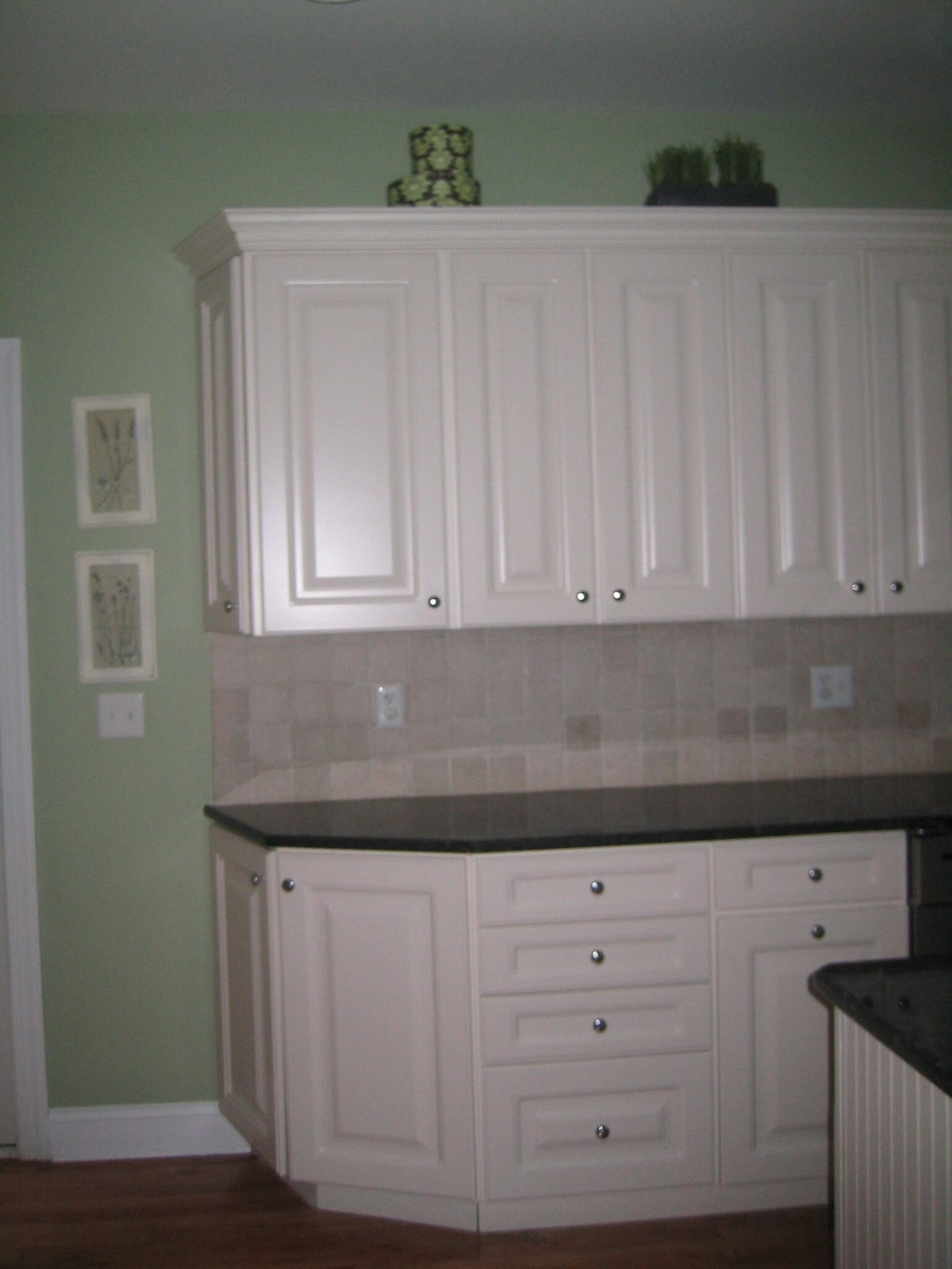
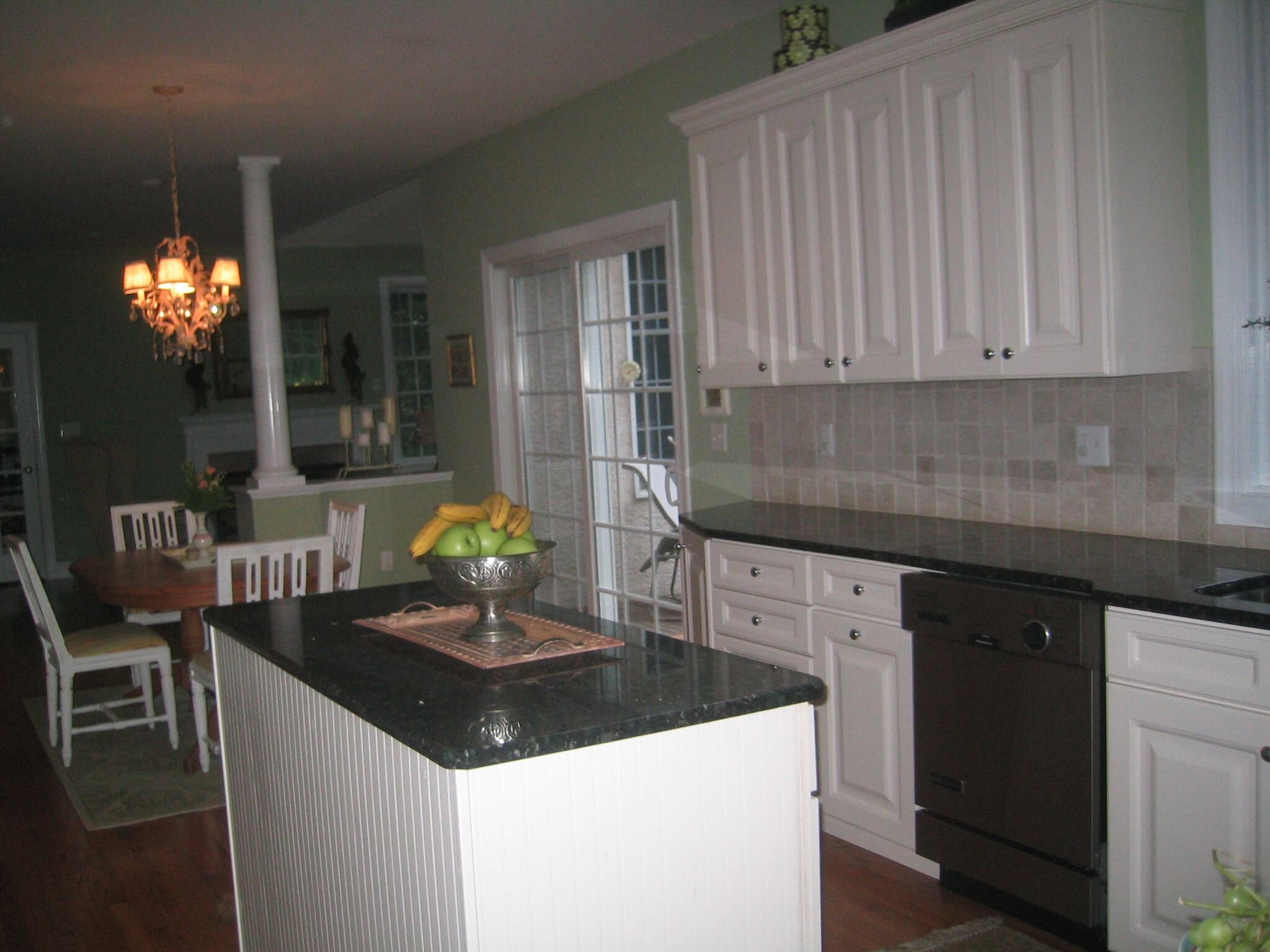
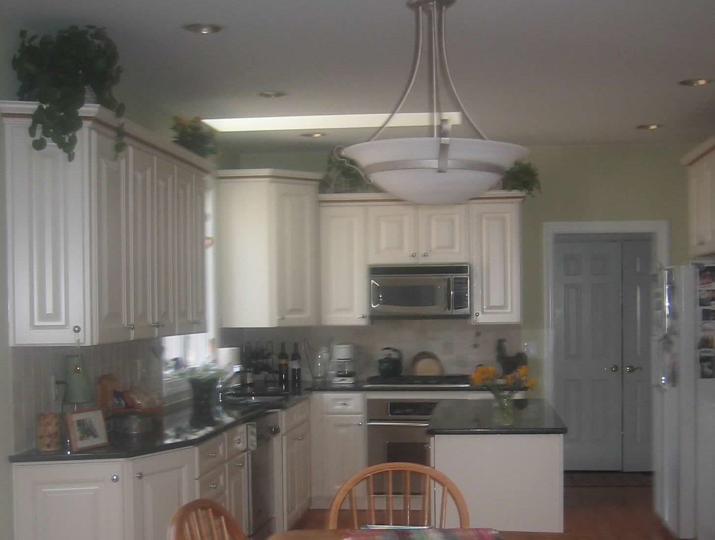
Blurry real estate photo
If your home was built in the 90’s this layout looks very familiar. The L-shaped kitchen with an island that you could either sit at or not was the typical layout. The cabinetry varied in height and was angled/rounded at the corners. Raised panel doors, granite and tumbled marble were HUGE. It was certainly functional and practical.
We decided to keep the same layout so if you have this footprint in your kitchen and it works you can refresh it without necessarily moving plumbing and walls.
Every new kitchen design should start with the chef’s appliance selection so you can create a custom kitchen around his or her cooking needs/requirements and dimensions. In this case we chose Thermador appliances. The appliances easily fit with the current layout and they were available and in stock. I also like the way the Thermador fridge looks paneled and flush vs. another popular fridge brand. We kept the 36” size range and moved the microwave to the island which allowed us to design this custom sleek wood hood with clean lines and no trim. Doing a deep dive into how you use your kitchen and how you want to use your kitchen post renovation will help you create the perfect design for you.
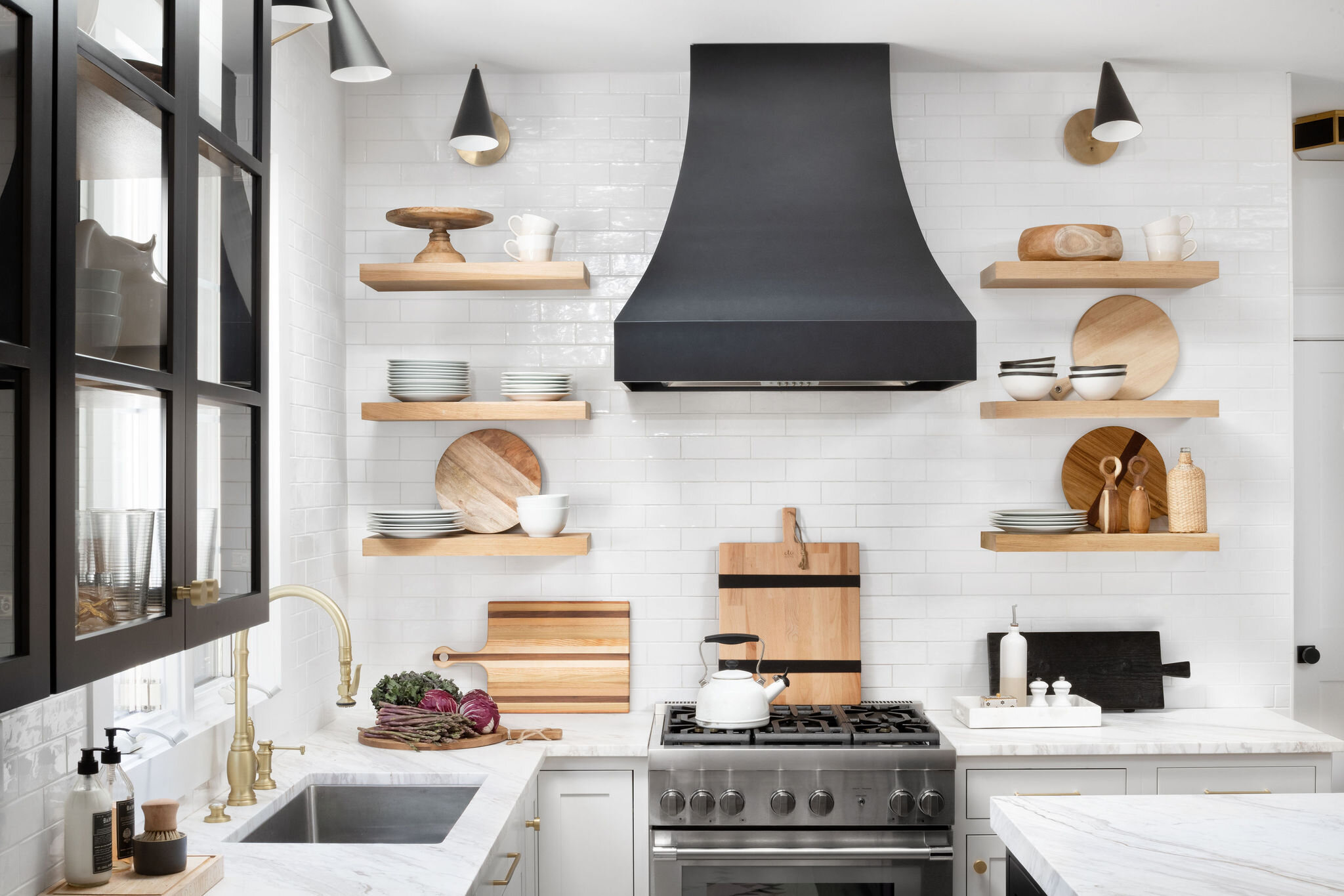
Custom black hood and open shelves. Custom glass cabinet with glass on all three sides.
To keep the kitchen feeling light and airy we only kept one upper wall cabinet and made it the focal point in this kitchen. It was custom designed and fabricated by a local cabinet maker Salvage Works. It took awhile to get the design just right. It has glass on all three sides which makes it extremely heavy so installation was also very important. The interior shelves are white oak and the glass is tempered.
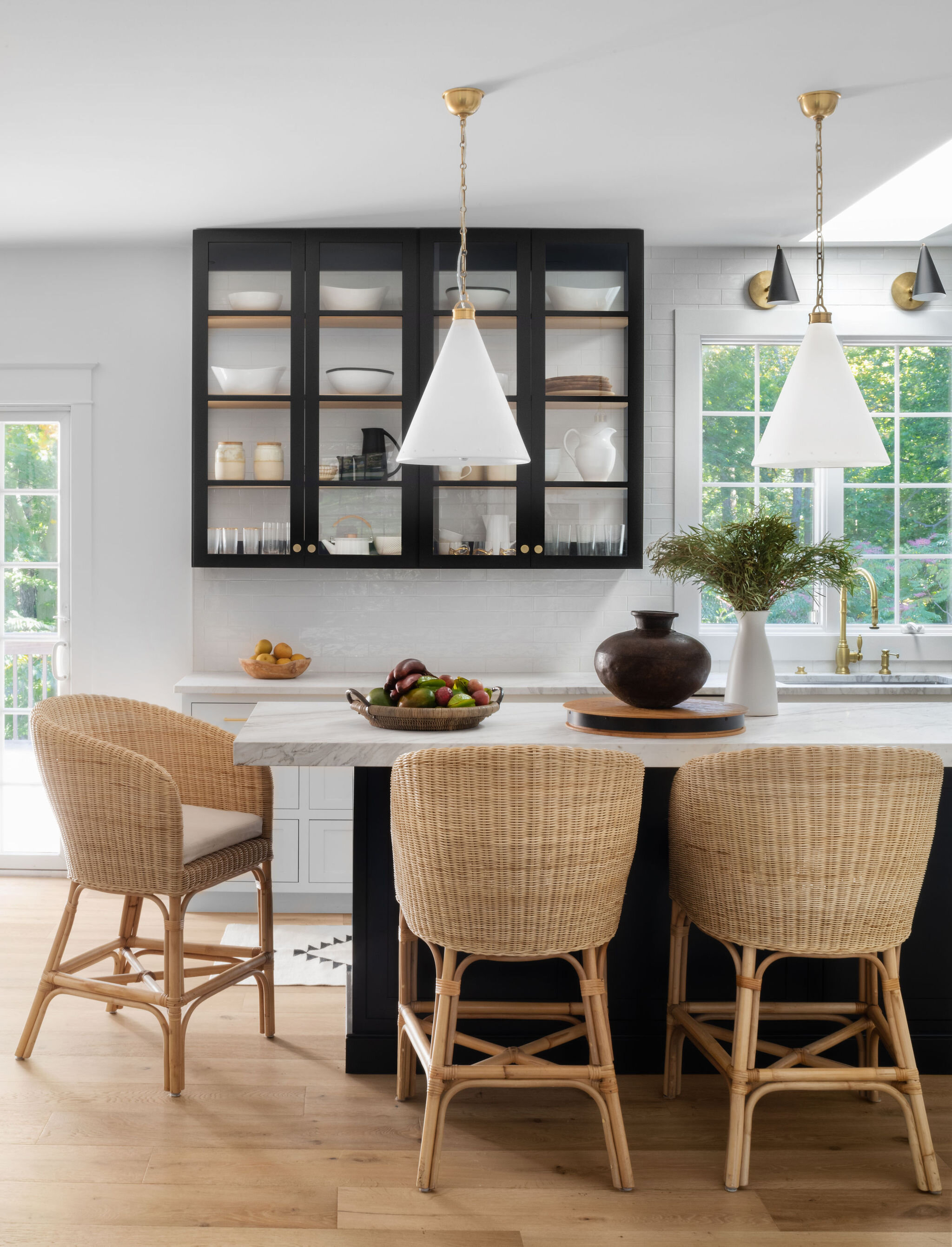
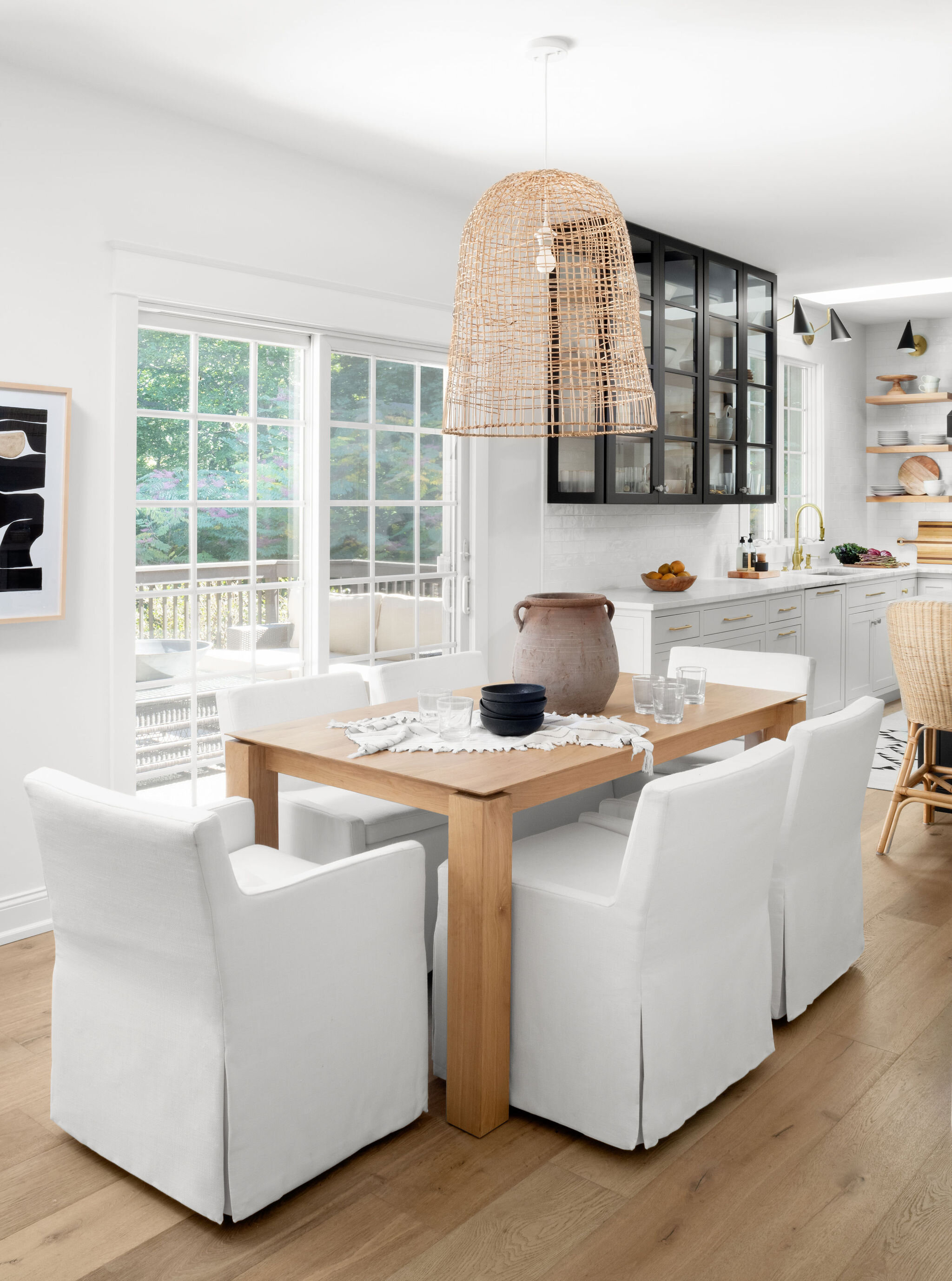
On the opposite side of the kitchen the cabinets were removed. We recessed the pantry and the fridge utilizing dead space in the garage and built a foundation in the garage strong enough to hold the new, very heavy fridge. This gives the appearance the cabinets and fridge are built in and completely flush with the wall. So cool. We also removed the header and moved the doorway so you can really appreciate the 9 foot high ceilings. New wide plank, white oak floors were installed and gorgeous new calcutta crema marble counters were added to round out this fabulous new kitchen.
Carefully and thoughtfully creating these unique custom kitchen elements is what makes this space feel more like an experience than just a utilitarian space. The satin brass hardware and faucet as well as the decorative lighting feels like jewelry in here and helps to create a mood and feeling while relaxing and have a meal.
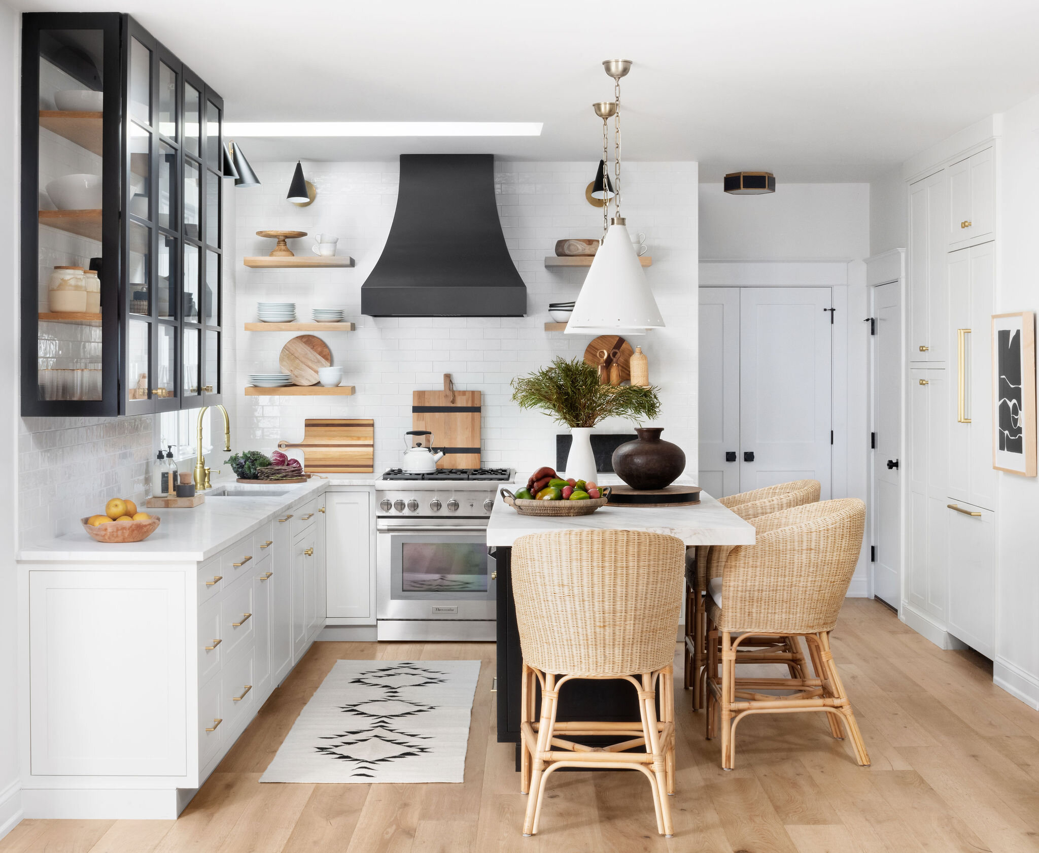
We love creating custom kitchens and homes that really speak to the homeowner, their needs and aesthetic. I hope you enjoyed the details we shared and the insight on how to upgrade your current kitchen without necessarily changing the layout.
Thanks for reading! xoxo

Wow. Hard to recognize the old kitchen. Love the area around the fridge.
Wow, beautiful kitchen! Those stools are amazing! Do you mind sharing where they are from?