I know it’s fall and winter is upon us but I thought I would share a project I worked on this summer. It was a beach house built in the early 70’s and I don’t think much changed in this house until my clients and current owners purchased the home last year.
So, a little background on this house– the owners hired me for a temporary fix. Yep. Temporary.
Just to get it up and running and functional for a season or two because they weren’t sure if they were going to sell it or tear it down and build new. So as you can imagine it was a
VERY
tight budget
knowing it may not be there next year.
And NO new kitchen, NO new bathrooms, NO new window treatments or major renovations of any kind were done and happy to say it turned out so pretty they may keep it longer than expected.
AND I think it’s a great example of how you don’t have to tear these old houses down just spruce them up a bit and they can be so charming! One more interesting fact is the owner grew up coming here as a boy. He knew the family and knew that the house was filled with love and special memories and he wanted to re-create that same feeling for his family.
Without further ado, I’ll share the before pictures of the entry as my clients found it
Entry Before

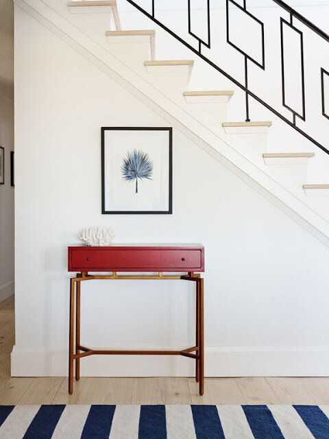
The wall-to-wall carpet was removed. New cypress flooring was bleached to keep it from yellowing and then installed. The dark wood paneling was kept just painted decorators white and all of the trim was painted super white by Benjamin Moore. The red console is from Host Interiors Ardmore, PA and is by
Mitchell Gold and Bob Williams
. I love this console for tight spaces and trust me it’s a great red.
The owners weren’t sure what to do with the iron railing but I wanted to keep it as is. I love the lines of this railing. They just don’t make’em like this anymore. Look how fresh and clean the space looks now.
At the end of the entry we had this BEFORE

This was sort of an awkward space because to the left of this bench is the entrance to a bedroom. But we added a bench and a few custom pillows.
In every project I try to use fabrics and pieces that I’ve never seen/used before and that have personal meaning to my clients. I usually get tired of seeing the same fabrics and furniture pieces used over again and I don’t want my clients house to feel like a furniture showroom, RH or PB or whatever their favorite furniture/accessory store may be. It has less meaning and it would feel like they’ve seen this before… right?
In addition, I always try to include something custom and original in every room to make it special and specific to each homeowner.
So as an ode to the owner who is an avid fisherman and boater we added the red Manuel Canovas calypso pillow in red and the navy and white “flagish” looking pillow on the bench. Just enough (I hope) without being too “theme-y”
I also added a large mirror to open the hallway and reflect light from the new door the client added. You can also see the modern flush mount lighting we added in the reflection of this mirror. The new design of this space turned this dark entry into a light-filled fabulous space.
The goal was to turn this 70’s house into a clean, modern fresh space with clean lines yet keeping it a bit traditional in line with the client’s taste.
Stay tuned each week as I share the before and after’s of this fun, yet budget-minded beach abode!
oh and if you want more mind-blowing before and afters on the web check out
‘s One Room Challenge
. This is where talented designers transform one room in six weeks. Enjoy!
Thanks for reading!! xoxo

The power of paint. (And a great designer.) It never gets old.
PAINT = AMAZING! thanks!! xo
Thanks for the mention, Stephanie! I am in love with this beach house. Every day is a beach day, here :).
This is great Stephanie! Can't wait to see more!
This is beautiful. I love the iron railing too. Those floors are to die for.
Love!! Really love how you had the eye and the vision to keep that original metal railing. That looks amazing!
Wow – completely transformed space!!! Thoughtfully selected pieces do make it more inviting. Well done 🙂
Darlene
Oh, and I'm so glad you kept the stair railing. It looks terrific!
Stunning! And the railing looks as if it is new surrounded by the pristine white paint. Can't wait to see more.